NOTE: This is a restricted access system, and no public links are available.
The USMC project requested an enhanced system to replace and modernize their 8 year old legacy system. I did the framework (as seen here), as well as the user interface design; color scheme, navigation, and data presentation.
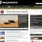
The inspiration for the UX came from the MARCORSYSCOM public website:
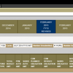
System usage was broken down into four tiers, the first three represented by the horizontal menu navigation, and the few items requiring a fourth tier are present from both a drop-down menu and text-based links on the page as well.
Each “stripe” in the menu (gray, tan, brown) is highlighted into the selected item below it so that the user can easily see where they are in the system. A breadcrumb trail is also present on the white “stripe” line and is clickable to step back in the process if necessary.
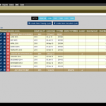
Listing of planning and execution cycles with filtering for appropriations (top) and fiscal year (top right). This allows a top-level view of the funding process.
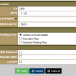
Creating a new cycle:
Combined planning and execution cycles into a chronological order:
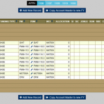
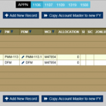
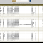
Listing of account records showing one subset of data expanded:
Hover text displays the creation of the record without requiring a large amount of space on the row, since there are already many columns displayed.
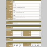
Sample form for creating an accounting record:
Audit trail sample:
Sample listing of funding documents:
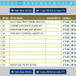
Sample lookup table administration screen:
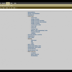
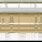
The menu navigation is database driven, and I built a GUI interface for easier administration:
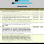
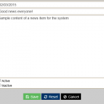
A notification system allows administrators to show news on the welcome screen after log in:
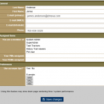
User account / preferences:
NOTE: All of the data in these screenshots is either sample/test data or public information.
